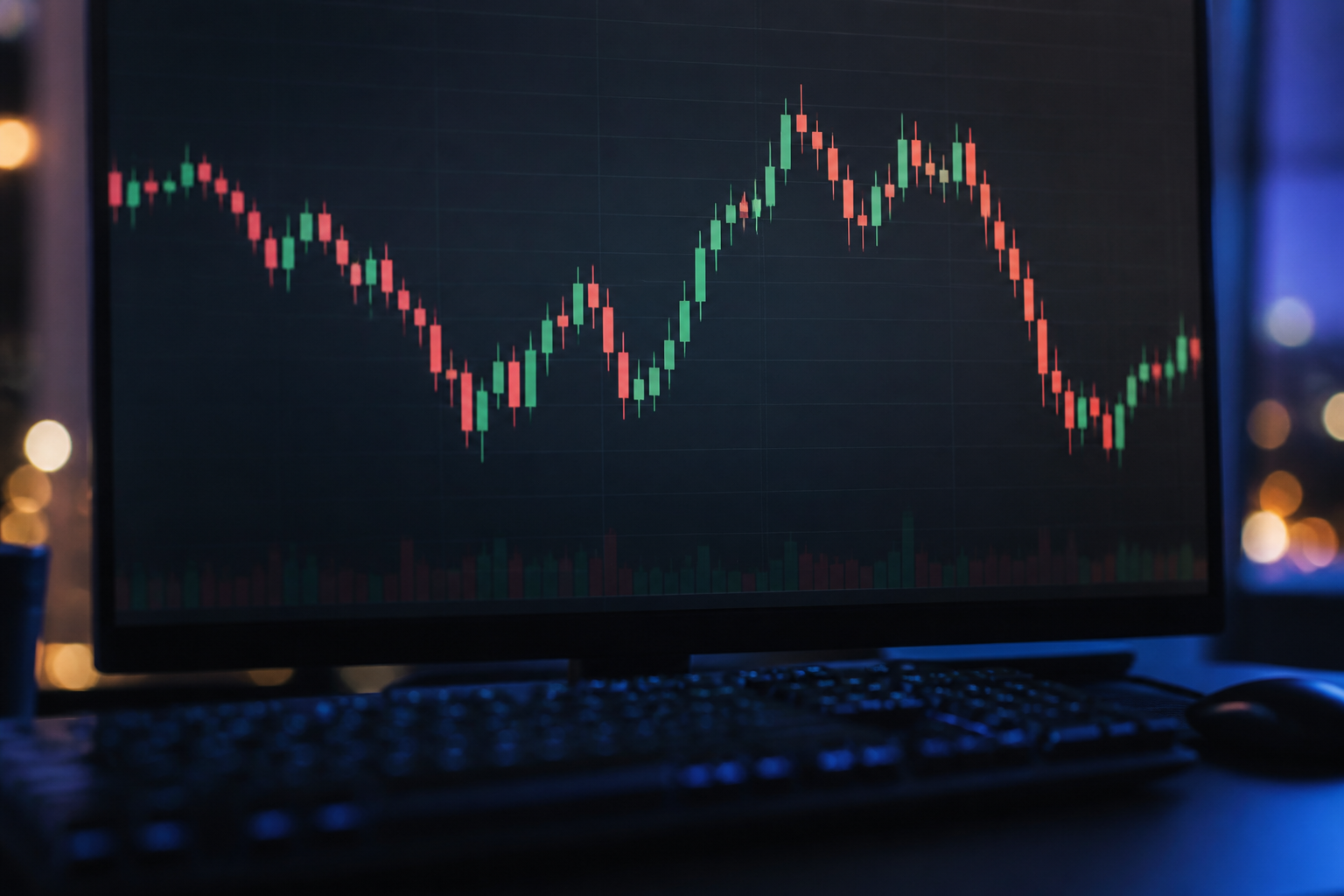
Learning how to read a Bitcoin price chart helps you stop guessing. A chart is a history of trades, not a promise. Beginners who understand candles, timeframes and volume make fewer impulsive clicks.
Candlesticks in one minute
Each candle shows open, high, low and close for a period. A green candle usually means the close was above the open; red the reverse. Wicks show extremes. One candle is a data point, not a prophecy.
Timeframes change the story
A five-minute chart is noise for a long-term investor. A daily or weekly chart shows the swings that actually matter if you plan to hold. Match the timeframe to your horizon or you will overtrade.
Volume and liquidity
Volume is how much changed hands. Thin volume can mean jumpy prices. Bitcoin is relatively liquid on major platforms, but “liquid” is not “stable”.
Support, resistance and humility
Horizontal levels where price stalled before are popular. They are observations, not physics. Plenty of breakouts fail. Use levels as context, not as a reason to bet the account.
What a chart cannot tell you
A chart does not know your rent date, your risk tolerance, or whether a tweet is true. Combine a simple chart read with position size rules. On Orizon Invest you can watch Bitcoin next to stocks and metals so one green candle does not become your whole personality.